How to create infographics: a guide with examples [+ free template]
Your content is a lot more attractive with visual information. Learn how to create infographics with our step-by-step guide.

What will we see in this post
There are several resources that can enrich your content and contribute to a good user experience on your page. One of them is the infographic, which, besides coming with important information for your audience, is useful to guide your reading in more pleasing and intuitive ways.
But do you really need to be or work with a designer to create infographics for your texts? Actually, you don’t!
Even though hiring an expert is always the best option, you can also create infographics without spending a lot of money, by using free tools available on the Internet.
Do you want to know how? Keep on reading this text until the end to find out!
What’s an infographic?
According to the dictionary, an infographic is: “A visual representation of information or data, such as a chart or a map, especially of information that is more easily imparted by such a representation than by written text.”
In practice, this resource is used to educate the reader before introducing them to a product or service.
Unlike what a lot of people out there think, infographics don’t need to have numbers to be relevant. All information that can be grouped together to make reading easier and improve the reader’s understanding of the topic can be turned into infographics.
Types of infographics
Just like any other media, infographics come in different formats, which can be used according to your need (attracting leads or increasing your sales) and the profile of your potential customer.
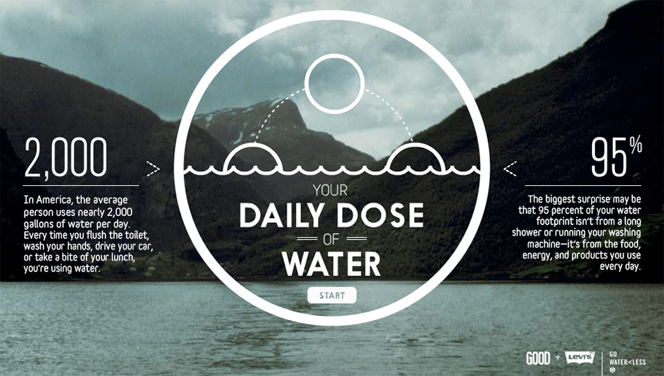
Interactive
As the name states, interactive infographics have elements that allow the reader to interact with the content with clickable links, menus, timeline, etc. Besides, being more visually attractive, they help to understand the information, since the user decides how they’ll read it.
(Source: https://piktochart.com/blog/infographic-hack-5-get-inspired-by-interactive-infographics/)
Static
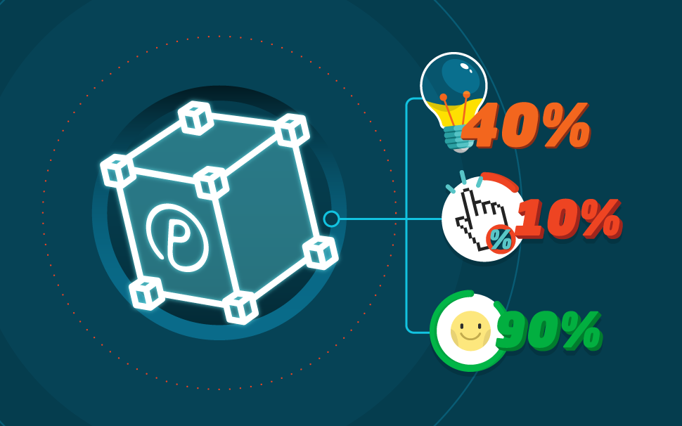
Static infographic comprises, usually, an image and a short text.
They are ideas to pass on simpler information, such as a numeric variation but also to explain more complex concepts, like a company’s organogram.
Since they don’t allow audience interaction, the piece should guide the visitors’ reading so as to not compromise the understanding of the message.
(Source: https://br.pinterest.com/tecdesignstudio/mobile-infographics/)
Animated
Animated infographic is created in the format of animated videos or GIF (Graphic Interchange Format), which are moving pieces.
They’re ideal to explain more complex topics besides being content that is more likely to be shared due to the way content is explained.
Because of the movement of the images, the process entails two parts: the drawing (art) and animation. You can create a drawing and use coding language to animate it or film the process and edit the video, which is a technique known as stop motion. Both cases require a bit more technical.
Why use infographics in your strategy?
The most simple explanation for why using infographics is that they make every content more interesting, besides being a simple tool to use that perfectly adjust to any business model.
Other interesting information about the usage of infographics according to the research made by Ethos 3 and Tweetar:
- Infographics can lead to an increase in visits to your website of up to 12%;
- In the past 5 years, the search for infographics on Google grew 25 times;
- Visual content, meaning the ones with at least one image or video have up to 40 times more chances of being shared on social media (which can become traffic to your channels);
- Infographics make passing on information easier, because they trigger both sides of the brain, the right one, responsible for viewing and interpreting images, and the left one, responsible for logical thinking. Therefore, the chances of memorizing a content are higher if there is at least one image involved;
- People remember about 80% of what they do or see.
Checklist to create an infographic
Decide your target audience
Who normally reads your blog? What are the needs of that audience? What kind of problem do they face in their everyday lives? What kind of information do they search on your website?
Learning the answer to these questions is essential to create assertive content that adds value to people who are reading it.
Why is this so important?
First, for the user experience on your page. And second, because quality content has higher chances of being shared and recommended to others.
If you still don’t know who the persona of your blog is, use information from analytics tools and opinion surveys to come up with this profile. Remember to also consider the structure of your sales funnel to create aligned content at each stage: knowledge, consideration and conversion.
Set your goal
What is your goal when creating this material? Are you trying to increase traffic on your blog, generate more leads, boost your sales?
It may look like a small detail, but knowing your goal right away is essential to choose the information the infographic needs to have.
For example, an infographic aiming to sell a product needs to make the benefits of the product clear or provide social proof that attests its quality.
However, if your goal is to attract more leads to work them later, the infographic may be made available to download in exchange for the visitor’s email.
But, to do so, you also need the infographic to have relevant information, which the user doesn’t extract only by reading the text because that is key for the person to willingly provide their contact information in exchange of the content.
Research about the topic
No piece, graphic, text or otherwise, can be produced without in-depth research on the topic.
Access websites about the subject, look for online and offline references and try to focus on questions the users have that haven’t been answered by your competitors yet.
An easy way to find out topics for your infographic is to search on Google and, on the results page check the terms that come up as related searches on the bottom of the page.
Select the most relevant information
In our text about design, we showed that, when several elements call our attention in a graphic piece, the user gets confused and can’t extract the information that might help her at that time. Therefore, having a focus is essential when creating an infographic.
If you’re talking about kids’ room decor, for example, choose only one aspect to talk about on the infographic, such as the price of the furniture. The rest of the information can be dealt on the text.
After you decide your topic, choose the information your infographic needs to have. In the case of the kids’ room decor, you want to compare prices of products, talk about the most sold furniture items, show cheaper alternatives for people who want to decorate it but are on a budget, etc.
Make a sketch of your infographic
After you have this information, you can sketch your infographic.
Create a document on Google Docs, Word or PowerPoint with the whole structure of your infographic, title, topics, menus, text, position of images and call to action, such as a download button.
Seven free tools to create an infographic
If you don’t have any knowledge of design, you should choose tools with the option to click and drag the elements because this makes the creation process of the infographic faster and more intuitive.
1. Canva
The infographic edit from Canva has a template library for people who wish to create an infographic from scratch.
From the moment you subscribe you can also access hundreds of free elements to increment the design of our graphic piece. The website also has different tools to manipulate and edit images, which makes it easy the process of creating the infographic.
2. Piktochart
PiktoChart offers 11 options of ready-to-use templates to create infographics and allows changing the background color, add or delete elements and manually manipulate images. The service also has a PRO option, which gives access to more template options and tools to personalize your infographic.
3. Easel.ly
Easel.ly has 15 options for infographic themes, all completely customized. With it, you get to change the disposition of the elements according to the theme of your infographic. The tool also has the option to click and drag, which gives you more autonomy when creating your infographic.
4. Google Charts
Google Charts was created for developers and allows creating tables, columns and graphics. Besides being a free tool, Google Charts is totally integrated with an HTML5 language, which is essential for creating interactive infographics.
It’s worth noticing that because it is a tool for developers, Google Charts has advanced features but the infographic creation process is also intuitive, just like any other feature made available by Google.
5. Visual.ly
Visual.ly allows you to create infographics from pre-ready templates available on the platform. To use it, just log in with your Facebook or Twitter account. You also have the option to load a picture or file from your computer and work your infographic from there.
6. Visme
Visme also has layouts that are 100% customizable. Just modify the items by clicking and dragging them as you need. One of the advantages of this service is that it has a variety of fonts and icons to make your infographic more attractive to look at.
7. Infogram
Infogram’s main difference is that the service allows the upload of Excel files. Meaning that you can export data easily to your infographic, without the need to copy and paste the information.
Tips to improve the performance of your infographic
Regardless of the goal of your infographic, there are some simple tips that might help improve the performance of your piece. Besides its looks (font and colors), other factors have an impact on your user experience and can make the difference in its conversion, such as:
Responsive Design
Always consider the users who surf the web on their smartphones or other mobile devices. This mindset is essential to create content that adjusts to any screen size and make your content, graphic and texts, more visible and legible.
Materialize the information
One of the main purposes of the infographic is to turn the information material to the user. Whenever you can, portray your information visually. This is important especially if you’re comparing data.
An example: suppose you’re trying to sell an ebook on productivity and focus for US$ 30.
You can make this information more relatable to your buyer persona by putting it this way:
“My product is US$ 30, which is the same as a 3-month Netflix subscription however you’ll have a lifetime of knowledge.”
Guide your user’s attention
If your infographic is more complex and data depends on one another to explain a situation or tell a story, always think how your user will navigate through it. Add visual cues such as arrows or numbers to show your user his next attention focus.
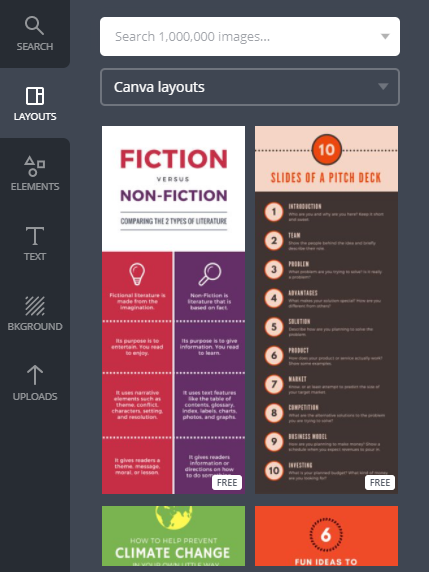
A tutorial to create an infographic on Canva
- Create your account on the platform. Because this is a free service, you get to sign up for Canva with your Facebook or Google Plus account.
- On the menu All your designs, scroll the screen to the section Blogging & eBooks and select the option Infographic.
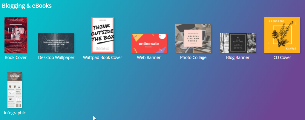
- On the left-side menu, you’ll find a selection of free and paid layouts. To select yours, just click on the image and drag it to the edit area.
- Then, you can select the icon to duplicate this layout, if your infographic is divided into two parts.
- All text boxes can be edited. The images, however, can be dragged to other areas on the page or simply deleted.
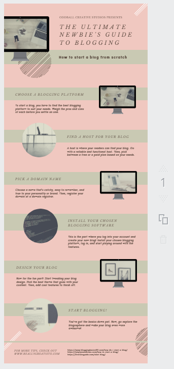
- To add text, just click the option text, on the left-side menu on the page. Click on add heading to add a title, add subheading for a subtitle or add a little bit of body text to create a new text window.
- To add images, click the option Uploads, on the left-side menu and then Upload your own images. Remember that images need to be saved in PNG so they don’t come with that solid white background.
You can still go to an icon database or online image bank to illustrate your infographic.
- If you want to add a link to your infographic, leading to other contents, just select the option “link” and paste the page address into the dialogue bar.
- Canva allows formatting your text according to your preferences of font, size, spacing, etc. Remember to always consider your buyer persona’s preferences whenever you’re editing the file.
![]()
- You can also share the infographic so other people can edit the information. Just select the option Share on the upper-right header and type the corresponding email address.
- After all changes are made, select the option File on the header of the page and then, Save. All set! Your infographic is ready to be shared.
Conclusion and infographic layout
In this text, you may have noticed that the infographic is a content that is easy to be created and, especially, consumed, since it makes it easier for the reader to understand the explanation.
It can be used in different moments of your marketing strategy, whether to attract leads, to nurture a relationship with your base and even to propose a sale. They’re also good choices of rich material because they’re less complex than an ebook but, at the same time, they can add value to your potential customer.
If you’re interested in content to educate your audience, take advantage to read our post on how to create ebooks.