

What will we see in this post
As the saying goes: first impressions are lasting impressions. In times of people starting their own online businesses, offering a good experience to users is no longer a stand out point.
Planning and monitoring your potential customers’ journey and experience on your website is nothing short of fundamental. In fact, it’s safe to say that If a customer has to think twice about how to complete their purchases because your page is not clear enough, there goes your sale.
Considering how the internet furthers a business’s reach and how the competition is fearless in most markets, it’s time to think about how to mitigate objections and how you can improve a customer’s journey by applying basic UX writing tips. Read on!
First things first: What is UX writing?
The digital transformation has brought about the need to change the way websites and digital products interact with their users. The fact that a lot of people access the internet on their mobile devices has only reinforced the need to change their communication.
In fact, there was a need to make the user’s journey more practical, objective, and above all, intuitive. That’s how UX writing started in the first place. Among a UX writer’s responsibility is creating small pieces of text, known as microcopy, the user encounters when navigating. That includes titles, buttons, CTAs, forms, and even error messages.
A UX writer guides the user through an app, website, or digital product, and makes sure that their journey is smooth and the best it can be.
Know your audience
Put yourself in your customer’s shoes.
- What are they after?
- How can you prove your product is what they need?
- What is their background?
- What tone should you use to approach them?
Considering your buyer’s persona is key, but don’t forget to make it as simple as possible. Don’t overcomplicate things. If your product is innovative, your language and tone need to follow accordingly. If you’re into a humorous approach, don’t forget to use it even on error pages.
Ux writing tips
Your language should fit your target’s audience personality
Understand the market and the audience the product is meant for. Don’t think for a second this can be done once and you’re done. Research needs to be constant, as the digital market and consumer behavior are constantly changing.
Be clear
Be concise, helpful, and guarantee your audience won’t have to wonder about where to click or how to complete a payment, for example. Avoid using passive voice, go straight to the point. Be organized and don’t forget about the product’s Usability. It’s key to building a successful product.
Listen to your audience
Monitor comments, create surveys. Making the best decision on the first try is rare and constant changes will most likely help evolve the product you’re working on.
Work closely with your UX designer/team
A UX writer should work with the designers and developers from the get-go. Only teamwork will enable them to test hypotheses, expressions, and really understand the audience in a way to provide a satisfactory journey to all users.
Be mindful of size/number of characters limits
As you already know, microcopy needs to be concise. But how concise do you need to be? Will that affect the number of characters you can use on a given button, for example? Definitely. That’s one more reason for UX writers being involved in projects from the start.
Pay close attention to buttons and CTAs
Work with the marketing team and copywriters not to use copy for buttons or CTAs that go against the company’s tone and style. Keep in mind that microcopy is just one of the aspects a UX writer has to consider. Gathering data and testing hypotheses, and applying that information to your website is a big part of the job.
Don’t forget about accessible UX writing
Thinking about accessibility is essential for UX professionals. A good tip is to avoid using images with messages, as visually-impaired people use tools that read texts aloud. If you do, try to make descriptive and detailed alt texts.
Links can also be confusing for screen readers. Instead of saying: “To learn more about marketing, click here.” Try linking on the actual text, such as in “Learn more about marketing.” This way, the reader will easily understand it.
Good examples of UX writing
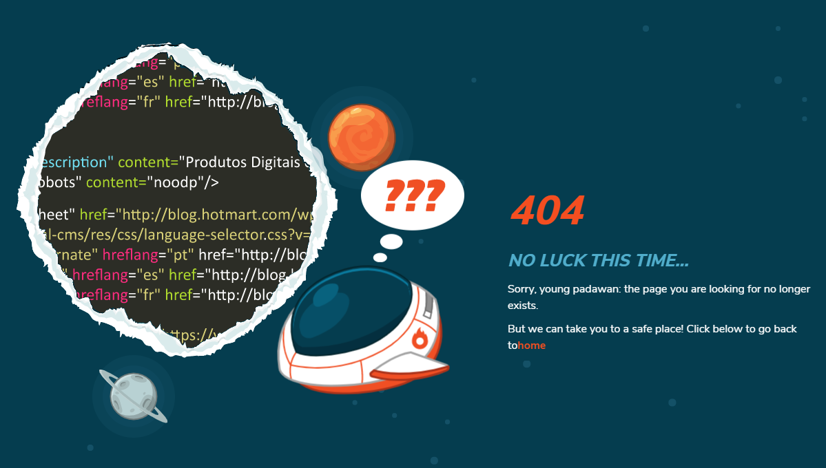
Error pages
Error pages may seem like something users will rarely encounter, and therefore, you don’t need to think through. Well, think again, because it may actually be a chance to reduce customer frustration and even engage them into remaining on your website longer.
Along with working with a UX designer to make sure your message fits with the design, our suggestion is: be creative, as long as it fits with your brand’s tone of voice and visual aesthetics. Show users a way out and be let them know this is an uncommon situation, keeping things light and humorous may fit well here.
Check out Hotmart’s example:
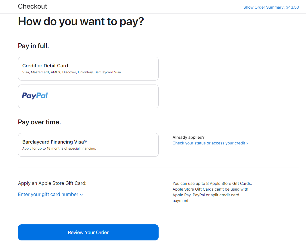
Checkout
Having a transparent checkout avoids refund requests and other issues commonly-associated with customer satisfaction.
Customers need to understand that by clicking on the button they’ll place an order. There can be no second-guessing. Adding a review order option is great to provide users with the chance of changing their order to correcting possible incorrect information.
As you can see below, Apple’s checkout experience is direct and clear. Using the question “How do you want to pay?” makes it more user friendly and offering payment options increases the odds of conversion.
Cohesion
TunnelBear style and tone are easily seen throughout the website and app. By connecting their visual style with their quirky UX writing, we can see they are focused on creating a great experience for customers.

Clear instructions

Mailchimp’s strategy to avoid errors in password creation is extra helpful and intuitive.
Showing a red message pointing out errors can be frustrating for some users, especially those that are unsure about signing up for a new platform. Mailchimp’s approach is visually appealing, informative, and lessens the chances of users abandoning the website.
UX writing is constantly evolving
As you’ve seen, UX writing is not something you can stop working on. Researching and making sure your customer has the most convenient journey possible at that moment is not enough if you think long term.
Not only do you need to make sure your brand and tone go together, but you also need to think about constant adjustments to your microcopy.
Remember: the clearer your customer’s journey is when purchasing your product or service, the better the odds you’ll make the sale.
In addition, keep in mind the work needs to be very collaborative, so getting everyone involved in the project is key to achieving positive results. On top of guaranteeing a great journey for your users on your app or website, getting them engaged with your content is essential to increase your conversions.