I’ve got many ad clicks, but no conversion. What should I do?
When it comes to paid ads, knowing what not to do can make a big difference in your strategy. Knowing how to do it correctly is even better. Keep reading and learn about the right techniques to promote your product.

What will we see in this post
Recently, we’ve seen that paid advertising is the shortest route to attract visibility to your brand while you are working on your organic strategy.
Once you’ve attracted a qualified audience to your page, the next step is ensuring that leads subscribe to get your offer.
But what can I do to make my ad clicks convert?
If you still have questions about how to optimize your page to conversion, one useful tip is knowing what not to do.
That’s what we’re talking about on this text. But we’re doing it a little differently. First, we’ll point out the most common mistakes in ads. Then we’re gonna show you how to optimize them to improve conversion, whether in sales or leads capture.
Segmentation
An excellent ad amounts to nothing if it’s not directed at the right audience. Even if your business comprises a very wide audience, you need to close in on a qualified audience for your offer.
How to solve it:
Use Google Adwords tools to segment your audience according to the interests of you buyer persona. Below you have some filter options that will allow you to narrow down your audience.
- Keywords
- access location
- user’s language
- age
- devices used
The good news is that you can combine more than one option and get an even more assertive result. For example: Women, from 25 to 40 years old, who live in the Greater Boston.
Landing page
The landing page is where leads are directed to when they click an ad.
If your link takes users to a generic page where they need to browse the whole website until they find out how to buy your product, you will divert them from your main goal: making the sale. And worse, they will look for similar offers in other pages.
How to solve it:
Your ad link must direct the lead to a clean squeeze page. There she will be able to learn more about the product in question.
Check out an example of a simple Sales Page:
A squeeze page is basically a landing page designed to capture leads. It normally has an eye-catching image and a form, that will lead to the next steps.
It’s up to you, as the advertiser, to ensure that your landing page is responsive and adapts to any mobile device.
And why is this important?
Recent studies from comScore show that mobile devices are the most used to access the internet around the world.
Which means that it is likely your prospect accesses your offer using the mobile phone while doing something else.
The obvious advantage of creating a page focused on converting instead of directing your audience to a generic page is that you increase your chances of making a sale.
In case you work with leads generation, your squeeze page must direct your visitor to the email capture form.
Once on your email base, you’ll have more time to work that lead and move her forward into the buyer’s journey. And always, by offering valuable content in exchange for each step she takes on your website.
Here at Hotmart, we make things simpler for the digital producer. We make a complete sales page available as soon as she joins the platform.
On this post, we talked about the sales page we offer.
Information about the product
If the lead has clicked your ad, you can get to the conclusion that your offer interested her. But it is wrong to presume the sale is guaranteed.
The good news is that you have at least a 50% chance of conversion. One of the most common mistakes at this stage is offering inaccurate or incomplete information.
How to solve it:
A good sales page must answer all your client’s questions and handle all her objections.
In the case of digital products make it clear:
- The topic of the course;
- Available materials (ebook, video lesson, audio);
- How many modules there are;
- Price;
- Payment options;
- Privacy Policies;
- Terms of Use;
- Disclaimer. It is important to make it clear that results the Producer has promised may be influenced by other factors.
And above all: value your offer! Show why it is different from the competition’s.
Invite a client to give her opinion about your product and, if you deem interesting, add review features.
The sales page must also have other contact information. It may be a telephone number or a support email, in case your client has any question.
We’ve talked more about it in the post how to create a sales page your affiliates will love.
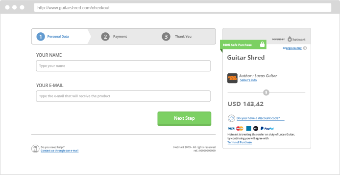
Checkout Page
When it comes to checkout pages, there is no definite formula. The best model will be the one that fits your audience best.
How to solve it:
If your checkout page has a long form, with too many fields to be filled, your sale will definitely suffer.
The tip, for these cases, is to opt for an optimized and objective Checkout, which makes the sales process easy.
Your sales page must be safe and trustworthy.
SSL (Security Sockets Layer) certificate and return policies must be clear so that the user feel safe to add her credit card information or account number.
Call to action
Call to Action (CTA) is the name given to the immediate response of the page. It may be subscribing to a newsletter, downloading an ebook, signing up for an advantage program, watching a video.
This action will change according to your product.
Depending on the purpose of your ad, the CTA button must be strategically positioned on the page, so that the lead doesn’t need to use the scrollbar.
The digital entrepreneur’s most common mistake is not making her CTA obvious.
How to solve it:
To improve that, besides the correct placement of the Call to Action button, you must invest in its appearance.
According to Eva Heller, author of the book The Psychology of Colors, each color is perceived by a different area of the brain. With this, some visual stimuli are more perceptible than others.
To get to this conclusion she interviewed more than two thousand different people from different ages and professions, including designers and architects, who work directly with colors.
In digital marketing, 93% of consumers consider that visual appearance is what matters the most to the final decision of purchasing.
Colors such as orange and yellow stimulate direct action and can be good options.
If we are talking about the color of the text, it should always be different from the page’s background. It makes reading easier and helps the lead to quickly identify what is the main action we expect her to take.
In your message, be short and to the point.
Here you can invest in the idea of urgency to persuade your lead. She needs to believe your offer is imperative to buy your product sooner rather than later!
Email marketing strategy
A common practice of some entrepreneurs and companies is spamming their base inbox with many offers, without segmentation or set frequency.
Because of the lack of criteria when sending the emails, many of these messages are automatically stopped by email filters and sent to the SPAM folder.
The ones that manage to go to inbox, end up forgotten and, many times, the user requests to opt-out of that list.
How to solve it:
Having a good email marketing strategy is key to nourish your relationship with your lead and keep it active.
Is order to so efficiently, you’ll need to segment your base.
Split leads who have already purchased something from you from those who filled out the form and gave up the sale, after all, they’re in different stages in the buyer’s journey.
Use effective tools to send and monitor these emails.
These tools will give you precise information about the open rate, click through rate, and rejection rate that will be useful to direct your next ads.
And never, no matter what, buy an email list from another entrepreneur or company. Even if you share the same niche market.
The user doesn’t react well when receiving emails about websites and services she has never used and to which she hasn’t signed up for.
In this case, your promotion may even become inconvenient.
Copywriting
Copywriting is the art of persuading visitors to take an action: it may be to sign up for your Newsletter, to click your ad, or even to buy your product.
If your message is not in accordance with your proposal, certainly the user will abandon your page and there goes your conversion.
How to solve it:
Having this in mind, it is necessary for you to know your audience well and have a very defined buyer persona.
Using generic keywords on your ad only makes you another one in the crowd. Especially if the keyword you chose is not related to your product and is not mentioned on your sales page.
What’s right is choosing a language that creates identification and empathy towards your audience. Something that calls their attention and directs them to the offer they are waiting for when clicking the ad.
This will help you be more assertive on your offer.
If you use Google AdWords to run your ads, you can add negative keywords to filter traffic and restrict your ad to users who are more qualified to buy your products.
Performance monitoring
Producers who are beginners tend to put this stage aside, whether due to lack of knowledge of tools or because they scarcely launch campaigns.
By skipping this monitoring they can’t tell positive and negative aspects of their ad apart and keep replicating variations of the same topic.
How to solve it:
Many of them don’t know how simple the process is. Most tools to make a complete analysis of your audience are offered by Analytics.
You’ll just need a Google email account and voilá! All the information you need to know will be there, including where your accesses come from, most searched terms related to your offer and your ad’s conversion rate.
Multivariate testing or A/B testing is another great resource to find out why your ad isn’t converting.
You just have to run ads with different texts and images to the same audience and analyze which one develops the best performance.
It’s advisable to test one element at a time. This way you will have a more assertive result on the element that undermines or contributes to the performance of your ad.
It’s important to know that the process is not always linear. You will need to test many hypotheses until you find out the right way of approaching your audience.
Don’t forget to document your discoveries so that, in the future, people who work with you know what works and what doesn’t when promoting your digital product.
Was this article useful for you? Leave your comments in the section below! :)


