
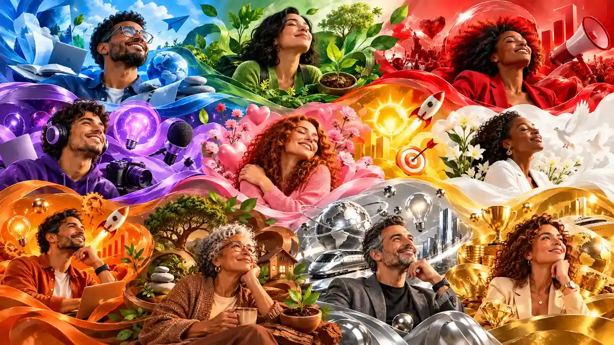
Color psychology: what it is, what each color means and how to use it in marketing
Learn what color psychology is, what 13 colors mean and how they combine, and discover how to choose the ideal palette for your brand, course or sales page.

What will we see in this post

Before you even read a brand’s name, understand what a product offers or look closely at a sales page, you’ve already been exposed to the colors used in that communication. Colors help create a first impression, and they can trigger different associations, emotions and perceptions.
According to research from Kaunas University of Technology, in Lithuania, colors influence purchase decisions and can make marketing more effective.
That’s why choosing a palette shouldn’t be just an aesthetic decision. For digital entrepreneurs, color psychology can help build a consistent visual identity, highlight key information on a sales page and convey the perception the business wants to create.
In this article, you’ll learn what color psychology is, discover the meaning of 13 colors and see how to apply these concepts in marketing, including when creating courses, digital products and landing pages.
What is color psychology?
Color psychology is the field that studies how colors can influence people’s emotions, perceptions and behaviors, and it’s widely applied in areas such as marketing, advertising, communication and design.
This doesn’t mean a given color triggers the same reaction in everyone. Associations also depend on personal experience, context, color combinations and cultural factors.
For example, a well-designed color composition can capture a consumer’s attention, while a poorly used one can have the opposite effect. Some associations between colors and feelings are widely shared, but how each person perceives colors still depends on context and culture.
Where did the study of color psychology come from?
Curiosity about colors is as old as human history. Aristotle wrote about them in ancient times, and physicist Isaac Newton introduced the concept of the color wheel. The study of the relationship between colors, perception and feelings, however, gained momentum with Theory of Colours, published by Johann Wolfgang von Goethe in 1810.
Goethe’s work brought a different perspective to the study of colors, also considering how people perceive and experience them.
Decades later, German researcher Eva Heller took this relationship between colors and feelings further. She surveyed around 2,000 people to investigate associations between colors and different emotions and concepts.
Her work became one of the main references on the subject. Heller’s research is especially known for showing that the meaning we attach to colors doesn’t exist in isolation: it’s also shaped by culture, context and the combinations in which each color appears.
How does color psychology work?
Color psychology is based on how our brain perceives, interprets and associates different hues with feelings, ideas and experiences. This perception also depends on each person’s context, individual experiences and culture.
In marketing, this perception plays a strategic role. Colors are essential to building a strong visual identity and are a core part of any brand style guide, which is why choosing the right color palette is crucial.
A study published in Management Decision supports this point. According to the research, people make a judgment about a product within 90 seconds of first seeing it, and color accounts for up to 90% of the information behind that judgment.
That’s exactly why color psychology shouldn’t be reduced to a list of “colors that sell”. What matters most is understanding what each choice communicates, who it communicates to and in what context it will be used.
What does each color mean in color psychology?
When people talk about color meanings, some associations come up often: blue with trust, red with intensity, green with nature and so on. But meanings are more complex than these quick translations.
Eva Heller’s studies, for example, show that the same color can carry both positive and negative associations, and that combining different hues also changes how they’re perceived.
With that in mind, it’s worth getting to know the 13 colors studied by the author and what each one can communicate.
Read on to see what each color communicates:
1. Psychology of the color blue

Blue is usually associated with trust, calm, security, harmony and stability. It’s one of the colors most used by companies that want to convey credibility and professionalism.
In marketing, blue is common among tech, healthcare, financial services and digital platform companies. Facebook, Ford and Oral-B are some examples of brands that use blue in their identity.
For a digital business, blue can be a good choice when the goal is to build safer, more reliable and professional communication. But that doesn’t mean every business in these industries needs to use it.
2. Psychology of the color red

If blue leans toward calm, red sits at the opposite end. It’s a color associated with passion, intensity, energy, desire, warmth and action.
Its connection to fire and blood helps explain some of these associations. That’s why red can grab attention and create a sense of urgency or movement.
In marketing, the color often shows up in promotions, calls to action and food brands. Coca-Cola, McDonald’s and KFC are well-known examples.
On a sales page, red can be used to highlight important elements, such as calls to action. However, that doesn’t mean switching a button to red will automatically increase sales. A color’s performance needs to be evaluated within the context of the page and, when possible, validated through testing.
3. Psychology of the color yellow

Yellow usually evokes optimism, joy, energy, creativity and attention. It’s a bright, warm and visually striking color.
Like other colors, it can also carry less positive associations. In Eva Heller’s research, for example, yellow is linked both to optimism and recreation and to jealousy and envy.
That’s what makes context especially important. In a visual identity, yellow can make communication feel lighter, younger and more creative. Snapchat, Post-it and Nikon are examples of brands that tap into this perception.
For those who sell digital products, it can work especially well for businesses that want to convey creativity, enthusiasm or approachability.
4. Psychology of the color green

The psychology of the color green is strongly tied to nature, health, vitality, growth and balance.
The association is quite intuitive: green appears in vegetation, plants and many other elements of nature. That’s why it’s often used by brands related to health, sustainability, food and well-being. Heineken, John Deere, Spotify and WhatsApp are examples of brands that use green in their visual identity.
5. Psychology of the color purple

Purple is one of the colors most associated with creativity, imagination, spirituality, mystery, power and sophistication.
It can be especially interesting for businesses in personal development, creativity, beauty, spirituality and for products that want a more distinctive perception. Cadbury, Yahoo and Milka are well-known examples of brands that use purple as a signature element of their identity.
6. Psychology of the color black

Black can convey sophistication, power, elegance, authority and exclusivity, but it’s also associated with mystery, mourning and darkness.
This duality makes context decisive. In fashion and premium products, for example, black can reinforce a sense of luxury and sophistication. In other contexts, it may take on a more sober or dramatic tone.
In a digital business’s visual identity, black can work as the main color or as a neutral base to make other hues stand out. Uber, Chanel, Nike and Schwarzkopf are examples of brands that use black in their logos.
7. Psychology of the color white

White is associated with purity, simplicity, cleanliness, lightness and peace. That’s why it often appears in brands and spaces aiming for a clean, organized look. Nivea, Colgate and Dove are some examples.
In visual communication, it also has an important practical role: creating space, contrast and breathing room between elements. A predominantly white landing page, for example, can make information easier to organize when combined with a good visual hierarchy.
8. Psychology of the color pink

The psychology of the color pink is related to delicacy, affection, tenderness, romance and sensitivity.
The color has also gone through important cultural shifts. The association between pink and femininity, for example, isn’t fixed or universal. It was built and transformed over time.
Today, different shades of pink can communicate very different things. Light tones tend to reinforce delicacy, while bolder pinks can convey energy, creativity and attitude. Brands such as Barbie and Victoria’s Secret explore this color.
That’s why there’s no need to limit pink to beauty brands or a female audience. What shapes its perception is the combination of shade, context, language and positioning.
9. Psychology of the color orange

Orange usually conveys energy, enthusiasm, sociability, fun and closeness.
It’s a warm, vibrant color that appears in brands that want to spark movement and action without necessarily taking on an aggressive tone. Hotmart, Fanta and Nickelodeon are examples of brands that use orange both in their logos and in how they communicate with their audience.
10. Psychology of the color brown

Brown is related to earth, nature, stability, coziness and naturalness.
It’s a color very present in materials such as wood, leather and soil, which helps build associations with natural elements and feelings of comfort. It can be a good choice for brands that value tradition, handcrafted products, food, sustainability or a warmer, more welcoming look.
Some well-known brands that use brown are Nespresso, M&M’s and Hershey’s.
11. Psychology of the color gray

Gray is a neutral and versatile color, often associated with formality, balance, sobriety and neutrality.
Because it doesn’t compete much for attention, it can work as a base for a visual identity and let other colors take center stage. New Balance, WordPress and Nintendo are examples of brands that use gray.
In marketing, gray is common among tech, architecture, services and corporate brands. Depending on the shade and combinations used, it can take on a modern, sophisticated look.
12. Psychology of the color gold

Gold is usually associated with wealth, success, achievement, luxury, celebration and exclusivity. Some brands that use gold are Chevrolet, Versace and Ferrero Rocher.
Many of these associations come from the historical link between gold and value. But this perception is also cultural: in different societies, gold has carried meanings tied to spirituality and the sacred.
In brand communication, gold usually works better as an accent than as a dominant color. Combined with black, white or dark tones, it can help create a premium identity.
13. Psychology of the color silver

Silver is associated with modernity, technology, speed, innovation and understated sophistication.
Compared to gold, it tends to convey a less flashy sense of luxury. It’s also associated with science, intellect and precision. That’s why it can be a smart choice for technology, innovation and automotive brands, and for products seeking a more contemporary look. Some brands that use silver are Mercedes-Benz, Audi, Lexus, Apple and Tesla.
Just like gold, its effect depends heavily on the combination. Silver, white, black and blue, for example, can create a very technological and sophisticated identity.
What are the main color combinations and their meanings?
One of the most interesting takeaways from color psychology is that a color doesn’t need to be analyzed in isolation. Combining hues can completely change the message people perceive.
Some examples:
| Combination | Possible association |
|---|---|
| Blue + green + gold | Trust, security and value |
| Red + pink | Love, passion and affection |
| Black + gold + red | Power, strength and sophistication |
| Blue + white + silver | Technology, precision and modernity |
| Green + blue + white | Nature, calm and security |
| Orange + yellow + red | Energy, fun and enthusiasm |
These combinations aren’t a universal translation table. The proportion between colors, the chosen shade, the context and the other visual elements also affect perception.
That’s why a color psychology chart should be used as a reference, not as a ready-made recipe. The final choice needs to start from the message the brand wants to build.
Does color psychology change across cultures?
Yes. The meaning of colors can change depending on culture, historical period and even each individual’s personal experiences.
White is one of the clearest examples. In many Western contexts, it’s associated with purity and celebrations. In some Asian cultures, however, it can be linked to mourning.
This cultural dimension is especially important if you sell to different countries. Before choosing a palette for an international campaign, it’s worth understanding how that audience interprets colors.
Warm colors vs. cool colors: what is the difference?
Dividing colors into warm and cool is a practical way to understand some of the feelings associated with different hues.
- Warm colors: red, orange and yellow tend to convey energy, movement, enthusiasm and closeness.
- Cool colors: blue, green and purple are usually associated with calm, balance, tranquility and stability.
This distinction also shows up outside marketing. In architecture and interior design, for example, cool colors can help create a calmer feel and make certain spaces look larger, while warm tones can make a room feel closer and more welcoming.
The same logic applies to brand communication: a warm palette can help create a more energetic identity, while a cool palette can reinforce a sense of trust and serenity. But neither group is better. What matters is consistency between the palette and the brand’s personality.
What are the main books on color psychology?
If you want to dive deeper into the subject, you can start with two important references:
- Eva Heller’s study on color psychology (originally published in German as Wie Farben wirken): one of the best-known works on the topic. The author investigated the relationship between colors, feelings and concepts based on interviews with around 2,000 people and on historical and cultural research.
- Interaction of Color, by Josef Albers: a design classic that uses practical exercises to show how the perception of a color changes depending on the colors around it — very useful for brand and visual communication decisions.
Both works can help people in communication, design, branding or marketing go beyond the most obvious associations and understand how context and combinations affect perception.
How to choose the ideal color palette for a course or digital business
If you sell an online course or digital product, choosing a palette means thinking about more than how your brand looks. Colors will be present on the product cover, on social media, in ads, in lesson materials and, above all, at the points where your audience needs to make a decision.
A good way to start is to connect your niche with the perception you want to convey:
| Niche | Colors to consider | Possible associations |
|---|---|---|
| Health and weight loss | Blue and green | Balance, health and trust |
| Finance and business | Blue, green and black | Security, stability and authority |
| Personal development | Purple, orange and yellow | Creativity, energy and transformation |
These combinations are starting points, not fixed rules.
Imagine, for example, two finance courses. One may want to convey tradition and security and go with navy blue and dark green. The other may stand out with a younger, more laid-back approach and choose a more vibrant palette.
What matters is connecting three points: who your audience is, what the brand wants to communicate and what experience it wants to create.
Once you’ve defined your palette, consistency becomes just as important. The same colors should appear consistently across your visual identity, content, course cover, materials and sales page.
And there’s one more step: seeing what happens in practice.
On a sales page, for example, you can test a button color change to see whether it affects clicks and conversions. A/B testing is a safer way to evaluate a hypothesis than assuming a certain color will always perform better.
Ready to apply color psychology to your digital business?
Now you know that color psychology goes far beyond associating blue with trust or red with passion.
Colors can help build an identity, organize communication, create contrast and reinforce certain perceptions. But their effects aren’t universal: context, culture, combinations and individual experience are also part of the equation.
For those who sell courses and digital products, this means treating colors as part of your business strategy. Your palette can appear in your visual identity, course cover, social media, ads and sales page.
The secret is making sure these choices work together and match what the brand actually promises its audience. After all, a consistent visual identity isn’t just about making your business look good. It helps your audience recognize it, understand it and build a relationship with it.
FAQ: color psychology
Still have questions? Below, we answer some of the most frequently asked questions about color psychology. Take a look!
What is the best color for a sales page?
There's no universally best color for a sales page. The choice depends on your audience, brand positioning, product and the goal of each element on the page.
Colors like red and orange can work well for elements that need to grab attention, such as calls to action, because of their associations with action and urgency. But that doesn't make them automatically more effective.
Ideally, consider contrast, readability and consistency with your visual identity. When possible, it's also worth testing different versions of the page to understand how your own audience behaves.
How many colors should a brand's visual identity use?
As a starting point, a visual identity can work with 2 to 4 colors: one main color, one or two secondary colors and a neutral color.
The number, however, isn't an absolute rule. What matters most is staying consistent and setting a clear hierarchy so each color has a different role in your communication.
A well-defined palette helps keep your business recognizable across different channels, from Instagram to your sales page.
Is there a color that sells more?
No. There's no color that can sell more on its own.
What can exist is a choice that better suits a certain audience, product and context. The same color that helps one brand convey energy may hurt another that needs to communicate calm or sophistication.
So, instead of looking for a "best-selling color," it's worth asking: what perception does this color help my brand build?