Responsive web design: how can I create a sales page taking into account mobile access?
A page can be seen in different ways from different devices. That’s why it’s important to think of your user’s experience. Check out on this post how a responsive design can help your website to be mobile-friendly.


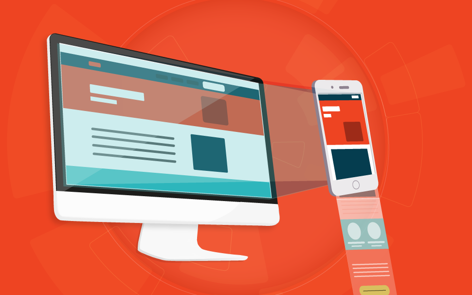
To put it simply: creating a sales page with a responsive web design means adapting your website to different devices that someone can use to access the Internet and open that page.
This means that a responsive web design is the one that adjusts to any screen you use to access a content, regardless of the size of this screen.
But before you even try to understand how to create a sales page thinking of mobile access, you need to know why this is interesting to your strategy. Here in this post, we’ll let you know:
After you read these 5 topics, we’re sure that you’ll be ready to start creating your sales page focusing on mobile access.
Enjoy the read!
1. How people consume the Internet
When the Internet was nothing but a distant dream, its purpose was to allow researchers to use computers from other Institutions if calculations were too large or if the other center was better at it. So academics have been using the Internet since the late 1980s.
Commercially, the network started in the early 1990s and Internet access was only dial-up using a very slow modem. High-speed Internet (at that time) was only for a few lucky ones and only at work.
But in 1996, broadband started being deployed, and by 2010, over 65% of Americans already had broadband available. In spite of that, it was still necessary to have computers to access the network, which restricted the Internet access.
In time, new improvements came up and the commercial price of computers and other devices that now supported the Internet became more accessible to the population. Besides, being able to use the Internet on other devices, especially smartphones, has played a major role in the increase of people connected on the web.
More than 40% of the world population has Internet access and people have new habits when it comes to this technology. According to a recent research by KPCB mobile technology trends, nowadays, 51% of Americans access the Internet using their smartphones.
Because of these changes in how people consume the Internet around the world and the different devices used to access the web, it was necessary to create pages that could be viewed on any screen.
And here is where the responsive web design comes in!
But before you understand how it works, you need to know the types of layouts that are most used.
2. Most used layout
As you can already tell, early on, the Internet pages were accessed through computers, that’s why huge layout changes weren’t needed. After all, the size of the screens was always the same, therefore, the way people viewed the pages was also the same.
For this reason, it was very common to use two types of layout: the fixed and the fluid.
Fixed Layout:
This type of layout has fixed widths already defined in pixels, which means that it is adjusted to only one type of screen. That’s why it’s not possible to have the same experience on a page with a fixed layout on the computer and on your mobile phone. It’s very likely that you can’t view the whole page if you change the size of the screen.
When most people used the computer to surf the Internet, the fixed layout was very interesting. After all, you would need to set up the format of your page only once and duplicate it whenever you made a new page.
However, it was necessary to change this scenery so that different people using any type of device with Internet access could have equal experiences on the same page.
Fluid Layout:
From the need to adapt the elements that are a part of a page to be mobile friendly, the fluid layout was created. It uses relative units to define the settings of width and formats on each page.
This means that the pixels aren’t used and were substituted by percentages, which allow the adaptation in different screen sizes. For example: if you set a width of 70% of the page, regardless of the width in which the page is opened, it always takes up 70% of the space.
But, despite the fluid layout being more flexible than the fixed, it was still necessary to improve even more the user experience in the pages. Then, the best option to handle all kinds of devices with Internet access is the responsive design.
3. The meaning of responsive design
A responsive design can be even better than a fluid layout. With it, it is possible to modify not only the width of your page but also the format and the dimension. So, when a person accesses your page, she can have a great browsing experience, since there will be no change in the content.
To have a responsive design means to worry about the different gadgets people use to view your sales pages. And even if there are any modifications, for the whole content to load clearly for every user, the changes will only be in the form how everything is arranged in the browser.
This means that a page with a responsive design is the one in which texts, images and everything that is made available for an online consult can increase, decrease or change positions in proportion, besides adjusting according to the size of the screen. This means that, the responsive layout is the one the organizes in the best way possible the content according to the device used by the user.
And how is that possible?
A responsive website is based on media queries. They are the ones that define the way each page should behave in every device used to open a website.
Basically, when you use media queries on your page, you can set personalized styles that are different to each device. This means that, you don’t need to make different layouts to each device. The page will always be the same, with all the content exactly the same, however, it will adjust according to the media that it is used to load your website.
4. The reason to create a page with a responsive web design
You’ve already noticed that with the Internet made popular, different people are now using it every day. And, because they are different, the users also use different devices to surf the web. These devices vary from really small screens, like smartphones, to huge TV screens.
So, if you want everybody to have access to your content, you need to think of a responsive design. Plus, there’s another reason to think about this kind of layout.
You know that content marketing is essential to make your business stand out online. And, you also know that the better ranked on Google searches, the more visibility your brand will have. So, it is very important to be in the first places of search engines and especially among the top 5 places.
Thinking of that, Google has been using different characteristics to rank pages as the best solutions for determined problems. And something that helps put your page on top is when it is mobile-friendly.
Having a page that adapts to mobile devices helps you rank your brand better on search engines. This means that having a responsive design is great for an SEO strategy.
Besides, being mobile-friendly can also influence the moment when a user decides to click on your page, or not. After all, if she is using a mobile device, she will prefer websites that load fast on that device.
To save time and money, the responsive design is a great option. Especially if you think that you would need to create several pages according to the screen the user has chosen. But, by opting for a responsive layout, you’ll need to create only one page.
5. Bonus: the 3 main components of the responsive design
Now that you’ve understood the importance of creating a sales page thinking about the mobile access, it’s time to get hands on and come up with a responsive design.
To help you out, we’ve got some tips on how you can start thinking about this type of layout. Maybe, depending on the knowledge you have about coding, you will need someone who understands more about it to have a 100% percent mobile-friendly page. But we have 3 suggestions that are a great start and that you can use right now!
Flexible images
The first item in which you need to think of are the images of your page. Use light images, meaning they can be loaded on any device. And remember to never set a fixed width and height for these images. Therefore, they can adjust better according to the grid you use.
Grid system
When creating your layout, remember to use grid systems. It’s there that all the elements of your website can be found. So, if they’re fluid and, especially, structured in percentages, the content of your website will be adjusted according to the size of the screen it is loaded on.
Media queries
As we’ve shown before, media queries are essential for a responsive design. They are responsible for adjusting your sales page according to the size, the resolution, and even the orientation of the device used by the user.
But if you still have any questions on how to technically apply the responsive design on your sales page, there’s always the option of hiring this kind of service. Nowadays, many developers offer this service.
So, you can research and calculate if the best strategy is to have someone who is a developer in your team or if you hire a company that provides this kind of service.
Conclusion
If your goal is to make that everybody has a complete experience on your sales page, you need to start using a responsive design.
You have already noticed that there’s no one kind of screen to access your content. You’ve also seen that there are many browser options for the Internet. So, having a layout that adapts to different situations is ideal.
That’s why you need to define the profile of your users and try to identify the main devices they use to access your content. After you have that in mind, apply the responsive design to your sales page.
Now that you know the importance of a responsive sales page, find out everything it needs to sell more. Download our free template!