Visuals to Include in Your Online Course
Visual elements every online course should have to increase student retention!

What will we see in this post
Epic visuals in your online course can actually turn it into one of those courses that students not only purchase, but also finish and rave about. The thing is, 90% of the folks who get into an online course don’t complete it. And the complaint “students are bored” is quite common.
Fortunately, visuals come with a plate full of merits. Not only do they capture your audience’s attention, they hold it too, guiding students from the start of the course to its end.
But that’s not all.
Our brains are geared toward understanding visual information 60,000 times faster than text. Visuals also make information easy to digest and recall, improving ability to memorize things.
That’s good news for your online course, isn’t it? But the important question is – which type of visuals should you include in your course?
Let’s address this in this post. We’ll also talk about some basics to pay attention to before you go about adding any visuals to your course.
Here we go:
4 Golden Rules of Adding Visuals in Your Online Course
Adding visuals to your online course is an art. There’s no formula you can crack to declare yourself successful. What you can do, however, is view your course from a student’s lens.
Ask yourself: are the images explaining your idea clearly? Is your course visually appealing or does it look like a bland wall of text mixed with random pictures? Are the visuals prompting your audience to read further?
So here’s what you need to pay attention to
Don’t use visuals without a purpose.
Each visual from the ones you add when you create a landing page for your course to the ones within the pages of your course should supplement your message – explaining concepts, presenting information, or simply engaging students.
Adding visuals only for the sake of doing so dilutes your takeaways. This also means you aren’t making the most of what visuals can actually do for your online course.
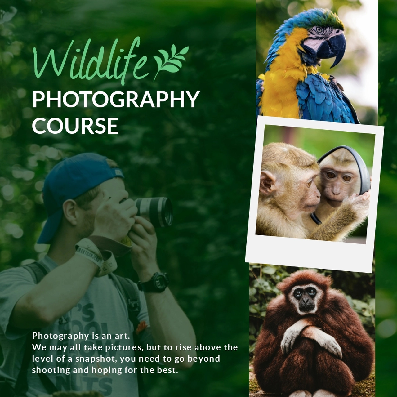
For instance, the images used in this template are all meaningful. They make sense as they promote the idea of wildlife photography, therefore, supplementing your message:
Follow a theme.
Always make sure the visuals you use in your course follow a theme. Select 2-3 fonts to use in your visual content and stick with them. Go with your brand colors. This means colors on your website, email newsletters, course, as well as the landing page should all follow a uniform theme.
Be consistent.
Consistency in design is crucial because it makes you memorable. Wondering how? Let’s say, you’ve sent out personalized emails to prospects for media coverage for your course (you can use a PR tool like Respona to set up an email campaign).
Your prospect sees an email signature made with bright colors. However, as soon as the prospect goes to your landing page, he finds a dull-toned shade.
Did you see what just happened here? You weren’t consistent in your theme. In such a case, your prospect is more likely to double back and forget all about you.
If you’re using templates, customize them to change the colors and fonts to meet your branding style.
Use only clear visuals.
It’s essential you use only clear and high-quality visuals when you create your online course. High quality images for products can improve conversions by three times in contrast with poor quality pictures. Think of what this could mean for your course.
You can use a presentation tool to download all designs in JPG, PNG, PDF, and HTML5 format depending on what’s needed. This ensures visual quality is crisp.
9 Visuals to Add in Your Online Course
So you know what you’ve got to do before you work out visuals into your online course. Let’s talk about which visuals to include now:
1. Screenshots and screen recordings
Screenshots are static images of your screen. On the flip side, screen recordings are videos of what you’re doing on your screen. For instance, this master course on typography uses screen recording to give a glimpse of what’s inside:
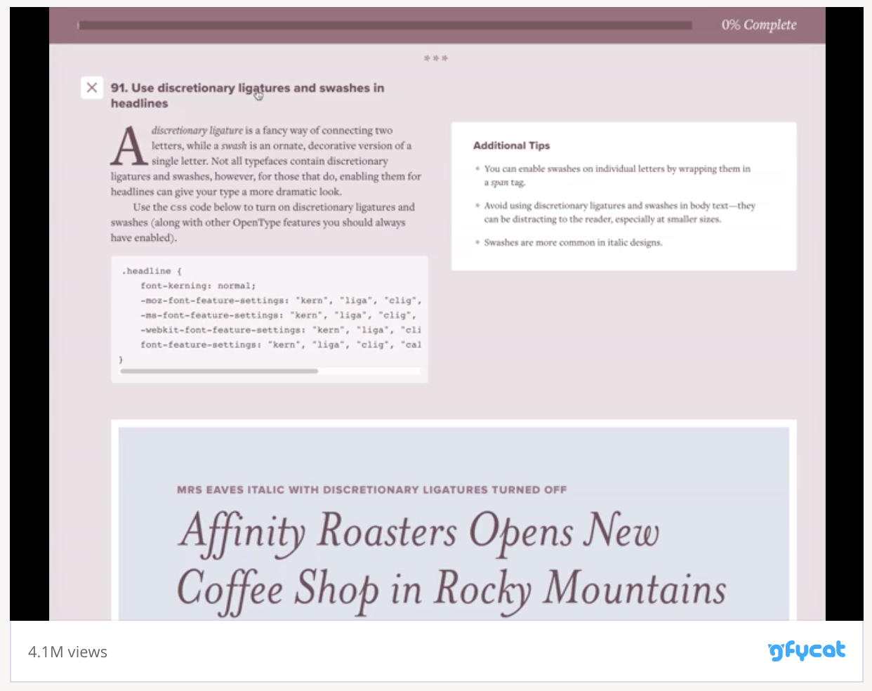
Screenshot from: https://www.typewolf.com/checklist
You can replicate such an approach in your course to explain steps. Both screenshots and screen recordings are best suitable for explaining processes to your students.
So if, for example, you’re teaching your audience how to create a blog, you can explain each step with the help of screenshots or record your screen in action.
2. Flow charts
Yep, flow charts exist outside the computer class you had as a kid. Like screenshots and recordings, these are also great at explaining processes in a digestible format. One look at the chart and your reader will know his next steps.
Put simply, flow charts guide users through a multi-step process, helping them understand outcomes dependent on the choices they make. You can make flow chart creation easy by using a template like the one below:
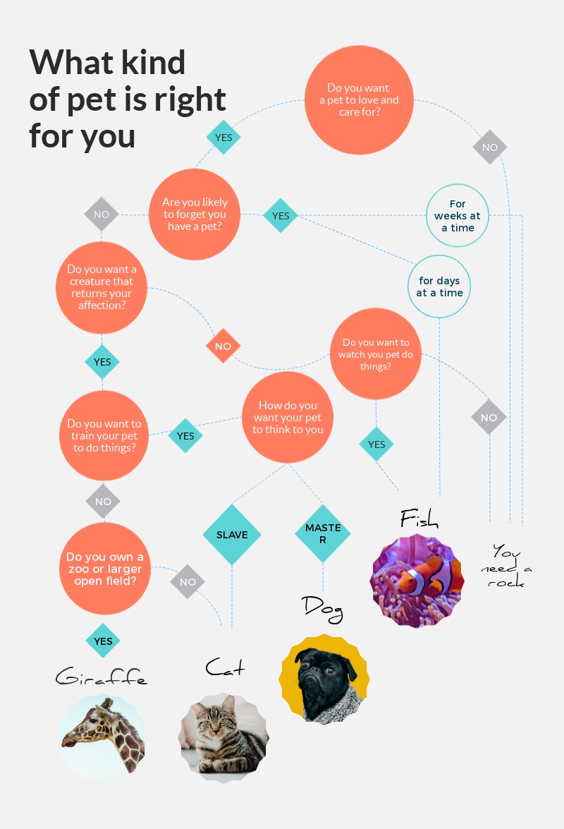
If none of these templates nail the design in mind, we go on to create these charts from scratch. This doesn’t take a ton of work since we already have a bank of shapes like squares, circles, and more to choose from.
3. Visual notes
This is one of my favorite visuals to add in an online course. Visual notes are electronic versions of post-its. You can add extra information or an interesting fact to them. Or, use them to give your student some food for thought.
You can also add quick bullet points in each visual note summarizing what a section talks about. So anyone who wants to revise the course can go through these notes.
Since these notes are visual by nature, it’s likely your audience reads them first, then digs into the rest of the section. Therefore, always make sure the information you add to these visual notes is intriguing.
For example, if you’re planning a course on wine-tasting, you can add visual notes sharing fascinating facts about the wine type you’re discussing to pique students’ interest.
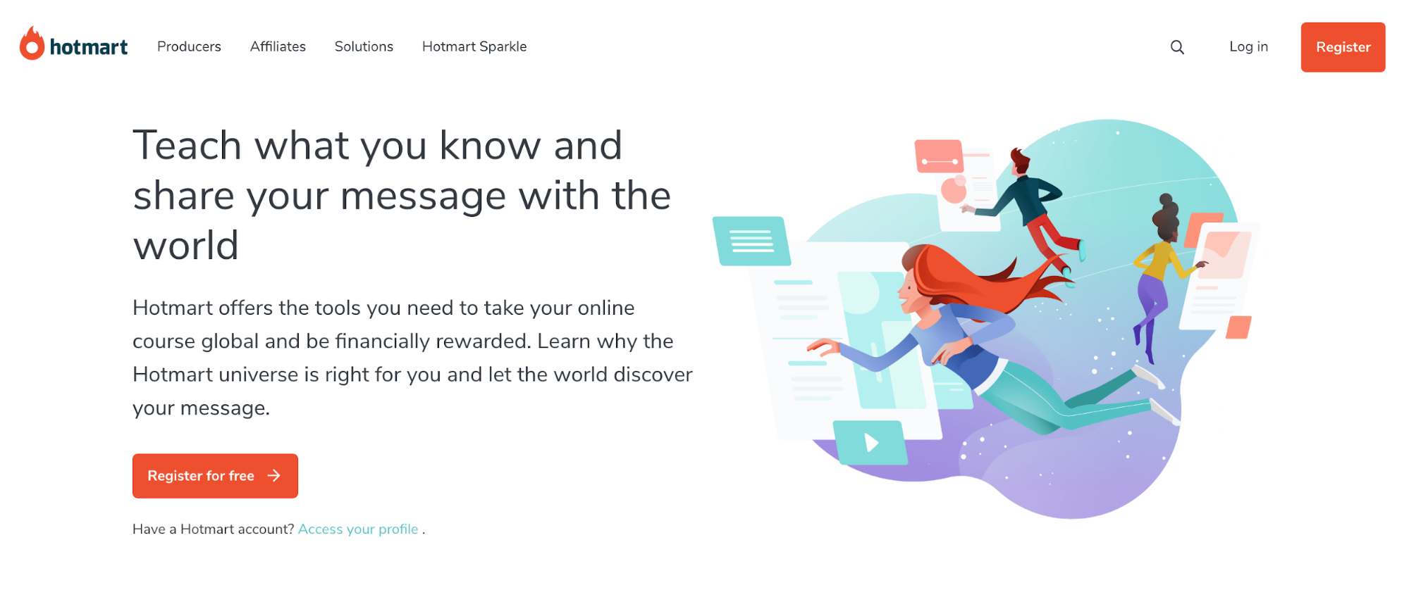
4. Illustrations
Illustrations are visual representations of text. Without a doubt, these teach your audience while holding their attention.
This visual type can be as detailed as the illustrations used here on Hotmart’s home page:
Or you can use icons to organize content to make it scannable, helping remove distractions and making it easy for your students to learn. For instance, use icons instead of bullet points to make your content more presentable and engaging.
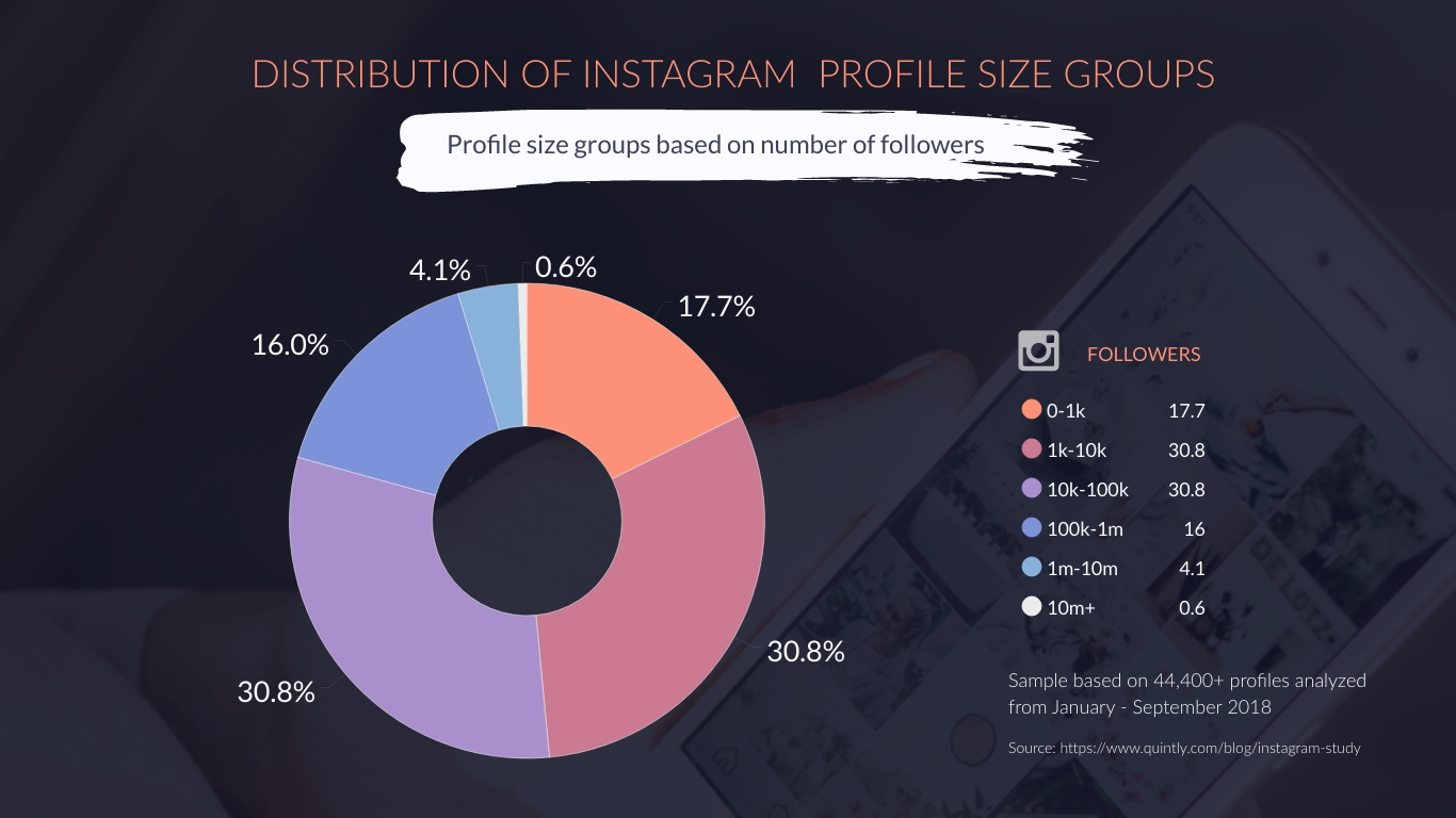
5. Charts and graphs
These visuals are great for courses that share numerical data. Charts and graphs can instantly make boring numbers exciting and understandable. One look at the chart and your reader will instantly know the statistics you’re conveying.
What’s more, these charts and graphs don’t need to be meh like the ones in annual accounting reports that take some energy to decipher. Instead, you can design engaging bar charts, circle graphs, and more.
6. Infographics
Infographics are all the rage. Thanks to their potential to package information in a medium that’s visually attractive. Think of it, really – would you read a wordy page or two to understand a process or would you prefer an infographic that combines illustrations and images with a bit of text? I’m positive it’s the latter.
Infographics also aid learning. Students retain more of what they learn via these visuals. Besides, these are time-saving.
If your student is in a rush, he or she can quickly reference the infographic in your course and catch up with the details at a later time. Alternatively, students can use an infographic to revise concepts.
Let’s say, you’ve created a course that talks about wine history. Create a timeline infographic to capture the history. You can also use how to, informational, process, anatomy, and comparison types of infographics.
7. Cartoons, comics and pictographs
Curses have a solid reputation of ugh-I-have-got-to-study-again. Luckily, cartoon characters or funny comics can increase the willingness to study by encouraging positive feelings.
Moreover, cartoon illustrations are known for effectively conveying information. But here’s the catch – you can’t work with just any character that comes to your mind.
You need cartoons that are relatable to your audience. Conducting audience research can, therefore, help understand your audience and design characters accordingly.
You can also add a touch of humor to your online course by designing relatable comics. These can instantly simplify complex concepts, making them easy to learn for even those with limited literacy in the subject.
A third visual to consider is pictograph. These are line diagrams or stick figures that can also explain processes effectively and prompt students to complete your online course.
Besides these benefits, comics, cartoons and pictographs add a friendly touch to your course, helping you gain your audience’s trust.
8. GIFs
More options to add to your visual bucket list for online courses include GIFs and animations. These visuals move, therefore, catch the eye better. Plus, they can convey your message effectively with all that movement.
If you think it’s not possible to add GIFs to educational content, think again. NASA designs plenty of educational GIFs that they use to explain complicated concepts to their audience.
9. Photographs
Last on this list – meaningful photographs. When used right, photographs can reduce cognitive load, make learning fun, and hold attention. So take the time to preplan them.
Don’t just slap pictures in your content, thinking they’ll break the text. Instead, choose images that clarify or add to the concept you’re covering in your course.
Remember your goal is to create a course that’s truly educational and teaches something to your audience. You can’t achieve that by selecting images that don’t support learning. Therefore, use them thoughtfully.
Create Your Own Visual Online Course
Don’t create a boring, text-only online course. Adding visuals is essential to keep your audience’s attention and help them learn and digest your information.
Once you’ve added these visuals into your online course, get started selling to your audience and generating digital product revenue for your business.
 Author Bio: Masooma Memon is a pizza-loving freelance writer by day and a novel nerd by night. She crafts research-backed, actionable blog posts for SaaS and marketing brands that aim to use quality content to educate and engage with their audience.