
Learn about landing pages and how to create one that converts
Would you like to increase your business’ sales opportunities? Well then, you need to learn how to create a conversion-focused landing page.

What will we see in this post

If you run a digital business, you probably already know how important it is to attract visitors to your brand’s channels. Plus, create strategies so that these visitors can be turned into leads and, in the future, into customers.
The problem is that many entrepreneurs have trouble converting visitors. Either because of lack of knowledge or because they use the wrong tools.
What if there were an easy-to-use tool that could greatly increase your business’ conversion rates?
Well, this tool exists, and it’s called a landing page!
Interested? Then keep reading this guide to understand once and for all what a landing page is, what its key elements are, how to create one that converts, and the best tools for creating one for your business.
Ready? Here’s what you’ll learn:
What a landing page is
A landing page is a web page created with a single goal: conversion.
Because of this, they don’t have a ton of information and only a single call to action (CTA). This way, it’s crystal clear what the visitor needs to do next.
Usually, the CTA is to share some personal information (name, email, etc.) in exchange for something they want, like an ebook, infographics, spreadsheets, or other relevant material.
In the example below, you’ll find a Hotmart landing page that’s used to promote educational material. Notice how there’s not much to distract the users from our focus: the signup form.
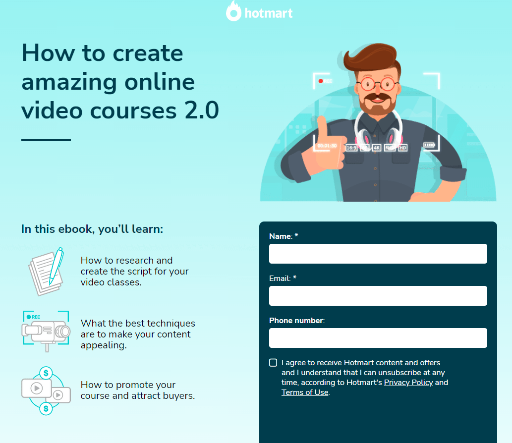
The smaller number of elements compared to a traditional page is because once you get a visitor to the landing page, all you want to do is convert that person into a lead.
With less elements and links to distract the user and make them leave the page, the chances of converting them and getting them in your sales funnel are much higher.
Why you need a landing page for your business
In most cases, a landing page increases your brand’s online visibility and attracts new users. The hope is that these new users will eventually become customers.
Landing pages should have a specific goal, such as:
- Attract new users to give their contact info so you can communicate with them later: a page that asks for the visitor’s contact information in exchange for something like an ebook or an infographic, for example.
- Bridge the gap between the user and your product’s checkout page, delivering enough content to make the user feel confident to make a purchase: it offers the essential information for the visitor to make a well-informed decision. These pages are usually used by e-commerce and membership sites.
- Highlight a specific product: if you sell more than one product, a landing page can help draw attention to just one of them. This is great for a launch.
- Guide users directly to making a purchase: a landing page that’s specific to your product helps visitors find their way to your checkout page without any distractions.
Additional benefits of a landing page
Having a page that’s 100% focused on conversion has a ton of advantages. Here are a few:
Help with lead scoring
A landing page allows you to generate leads and identify those visitors who are ready to buy, a process known as lead scoring.
This process consists of giving points to leads whenever they interact with your brand. The closer the interaction is to the bottom of your sales funnel, the higher the scoring is.
For example, a user who signs up on a top-of-funnel landing page earns fewer points than someone who downloads a bottom-of-funnel ebook.
By knowing who is most likely to buy, you can focus your attention on closing the deal with the right leads.
Allows lead segmenting
Another great advantage of a landing page is that it helps segment leads better.
You can segment leads according to how they were attracted to your business or product. Then, you can create groups and lists according to their interests and stage in your sales funnel.
Reduces customer acquisition costs
What are your options without the help of a landing page?
It would take hours of phone calls, interviews, and dozens of emails to do what a landing page does. In other words, a ton of work and money.
With a single landing page, you have access to all of your business’s most relevant audience information while spending practically nothing.
The key elements of a landing page
As mentioned earlier, this page has the goal of capturing leads by having people convert to a form, and your company captures the data of those prospective customers.
With this in mind, it’s important to highlight the main elements that a landing page must have for it to be more efficient and attractive.
Title and subtitle
An LP must have a good title and subtitle. This is the first information that the readers will see, so it needs to pique their interest in this first contact.
It’s important to create a catchy title that shows, with the help of the subtitle, what your page visitors can expect from the material.
But beware: this title needs to be attractive and consistent with the offered content. If the title attracts an audience who downloads the promised material on the landing page and, when they read it, realize that it doesn’t deliver what it promised, they’ll end up frustrated.
In this case, in addition to not finding the solution they expected, they’ll feel that you deceived them, giving a bad impression of your brand.
So, be creative with your titles, but don’t forget that the material needs to deliver what’s promised.
Image
Another element that helps put together a good LP is the image. It composes your page visually and helps readers build an idea of the main context of the offered material.
Since the image is meant to complete the concept presented by the landing page, you need to choose carefully to be cohesive with the rest of the page’s content.
Offer
A landing page is your chance to offer something of value to visitors to get their info in exchange. In other words, be direct about the benefits of what you’re giving away.
Use the text and image spaces wisely to present your offer. This will pique the visitor’s interest and make them feel compelled to share their contact info.
CTA
A CTA (call to action) is the link that will guide your leads to an action, i.e. it’s what will show them what to do next, what the next step is.
This component is critical for your page and it needs to have a few specific features, such as:
- Be direct
- Contain few words
- Be in the imperative (download now, subscribe, receive it in your email, etc.)
- Be clear and objective
All of these tips help your audience understand what comes after they have shared their info on your page. This sentence must explain what they should do next in as few words as possible.
Form
The capture form is where potential leads will enter their info. An LP’s ultimate goal is to get these fields filled in! But pay attention to what information you’re asking for and how.
Consider reducing the amount of requested information as much as possible. Ask only for the information you need for your current strategy.
Evaluate each field carefully, considering the objectives of the material linked to the LP so that it’s enough information but not too much. Asking for too much will only lead to potential leads abandoning the page.
Extra elements
Besides all the above items, other things can add value to your capture page and further strengthen your proposal. Social proof, videos, and graphical elements can direct the user’s attention.
All of this can help you complement your conversion page.
The different types of landing pages
As we explained earlier, a landing page can serve many different purposes. Because of this, we can divide them into a few categories, each aimed at various stages of your sales funnel.
Capture Page
This landing page format aims to capture contact info from potential customers, such as their name, email, and phone number.
A capture page usually features a free ebook or webinar.
To access this material, the visitor needs to fill in the information requested on the form.
Pending confirmation page
You know those pages where you sign up for a new service, like an online platform or a social network, and then you’re directed to a page that asks you to go to your email inbox and click on the confirmation message to finish the registration process?
This is what a pending confirmation page is for: to inform users of the next steps they need to take to complete their registration or access the reward.
The information on this page must be presented as simply as possible so that users don’t feel lost.
Sales Page
As the name suggests, a sales page has the main objective of offering a product or service.
To convince visitors to complete the purchase, it should list all the product’s benefits, making it very clear how it can solve the users’ pains. Customer testimonials and a section with the audience’s frequently asked questions are also welcome.
These features serve to guide users to the checkout page, where they will finalize the purchase.
Would you like to learn how to create a sales page that converts?
Thank You Page
The last type of landing page is a thank you page.
It serves to finalize a conversion, for both sales pages and capture pages.
With the thank you page, the lead knows that the action executed has been successfully completed. Here, you can aslo suggest the next step to be taken.
This step can be anything from sending them to a blog post on a related subject, downloading more educational material, or buying another product.
How to create a landing page
Now that you know what a landing page is, its importance, and different types, it’s time to learn how to create your own.
Creating a landing page that converts is not easy. First, you need to define the purpose of the page, then plan your content carefully.
To help you with this, let’s create a checklist with the main steps for an effective landing page.
Let’s get started?
Create the content
After defining your landing page’s goal, the next step is to create the content, such as the title, text, and images.
This step requires a lot of care since all of these elements will be responsible for informing the visitors about your offer and convincing them to enter their personal info.
- Title and subtitle: These should be catchy and pique the reader’s curiosity. In the title, describe what the visitor will gain by signing up. In the subtitle, offer extra information that will help convince the user to sign up.
- Texts: In the text, try to describe your offer as clearly as possible, eliminating any questions that may arise. Use short sentences and highlight the benefits of your offer.
- Images: The images on your landing page need to reflect your offer and relate to it. In this sense, avoid generic images.
Pay attention to the page’s layout
With all your landing page’s texts completed, the next step is defining and structuring the page’s appearance.
Design, as well as text, is an essential element in convincing users to share their info. The visual elements need to align with the text and your business’ identity.
- Template: The first item you need to pay attention to is your landing page template. Take care with the size of the text, the types of images used, and of course, the offer.
- Form fields: When defining which fields will be present on your form, take into consideration the offer, your persona, and the stage of the funnel in which the visitor is. Each landing page calls for a different number and type of fields.
- Page identity and images: The look and feel of your landing page needs to be in line with your brand identity, while giving prominence to key information and calls to action.
Landing page setup
After taking care of the page’s appearance, it’s time to get the final details right before publishing it online.
- URL: Your landing page address needs to be friendly. Avoid making it too long and use keywords.
- Lead scoring: Determine the score each lead will receive after converting on your landing page, and think about this user’s next steps in your sales funnel.
- Thank You Page: Have a thank you page for your offer, thanking users for registering and guiding them on how to access the offer.
- Testing and tracking: Keep a close eye on your landing page’s conversion rates and change whatever you feel is necessary. Conduct A/B tests of the original version against the changed version.
How to promote a landing page
Your landing page has been created and is ready to be promoted. If not, nobody will see it.
When choosing where to advertise your conversion page, try to base it on the channels most commonly used by your audience. Social media, websites, blogs, email marketing, and paid media are the most common ones.
Social media
If your business has profiles on the internet’s major social networks, take the opportunity to use these channels to generate leads.
Since your followers on social media are interested in your brand, chances are they will also be interested in your offer.
Create publications promoting your landing page link on Facebook, Twitter, Instagram, LinkedIn, and wherever else your business is present.
Website or blog
Another way of attracting more attention to your landing page is to take advantage of the existing traffic on your website or blog.
Take the opportunity to include links to your landing page on your website’s most visited pages and articles. Of course, make sure theme of these pages is related to the landing page offer.
Email marketing
Email marketing is one of the most efficient channels to communicate and strengthen your relationship with your audience.
You can send a message to promote your offer, whether it’s a new product or new educational material to download, and include a link to the landing page.
According to each leads profile and interest, work with segmented groups to further increase your landing page’s results and conversion.
And if you have a newsletter, you can advertise your page there.
Paid Media
Another way of boosting your landing pages is through paid media, traditional online ads.
You can create ads on Google Ads, Facebook Ads, Instagram, LinkedIn… wherever your audience is present.
Whichever platform you choose, don’t forget to segment your audience for the best results.
Co-marketing
Another option that can contribute to your strategy is co-marketing. This type of collaborative advertising is done through an agreement between two companies or entrepreneurs to boost their content’s organic advertising.
SEO for landing pages
A good tip to further improve your advertising is to think about SEO optimization for your landing page. Optimization can boost your capture page’s reach and influence the performance of search engines, such as Google.
A few good practices to improve your page are:
- Include the keyword in the LP’s textual content (title and body)
- Build a good meta description
- Configure the URL properly
- Use alt-text with images
- Write scannable text
Every aspect of SEO optimization should be taken into consideration and applied to your landing page, since this is an addition opportunity to make your content visible in an organic manner.
Must-have tools for creating a landing page
To create a landing page, you have three options:
- Create your page from scratch.
- Pay a professional to build the page for you.
- Use landing page creation tools (if you have a blog hosted on WordPress, you can also install a plugin on the platform to develop your page).
For those just starting to work with internet sales now, we suggest that you use ready-made layouts and customize them according to your persona‘s preferences.
Not only is your investment less, but your website will be ready faster, with no need for programming and web design know-how.
Various tools are currently available in the market to facilitate the landing page creation process. Check out a few!
LeadPages
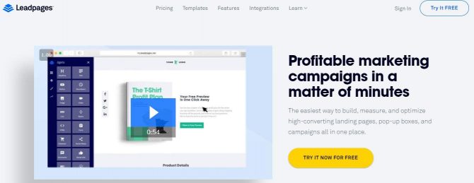
Leadpages allows you to create and edit your pages without any programming. It has several themes and layouts at very attractive prices.
Besides being cost-effective, Leadpages creates pages that work will on mobile devices.
Hubspot

Hubspot has a system for creating landing pages that can integrate with your content strategy.
The platform also provides extensive educational material for those who have questions regarding digital marketing.
Unbounce
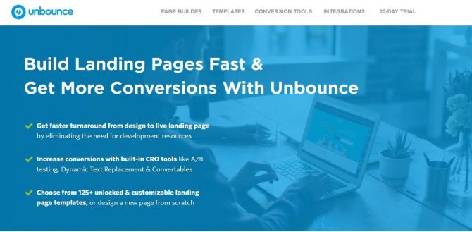
Unbounce provides users with various templates, options to customize, and offers A/B testing functionality to measure which pages convert the most. It’s one of the most widely used landing page services in the world and is ideal for creators and affiliates with higher sales volumes.
OptimizePress
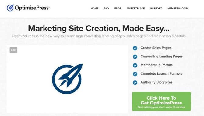
The main advantage of subscribing to Optimize Press is that you don’t just pay for the landing page, but a whole host of tools for your WordPress site.
You can create blogs, webinars, members’ areas, and have access to reports from all of these pages.
Instapage
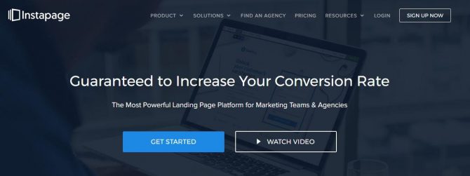
Similar to Unbounce, Instapage is also “click and drag,” making life easier for novice users who know little about editing tools.
There’s a free version of the tool with some limitations, and a basic plan for $29/month. You can also create your landing page by installing the Instapage plugin on WordPress.
Hotmart Page Creator
Hotmart creators and affiliates also have an option on our platform to create unique landing pages with Hotmart Page Creator.
With Hotmart Extension Page Creator, you can create landing pages, thank you pages, and capture pages. No coding involved.
The tool also allows you to customize existing templates or start a page from scratch.
Tips for a landing page that converts
At this point, you’ve probably found a tool to create your landing page. But that doesn’t mean your work stops there!
Now comes the part about customizing your page according to your persona’s interests.
Beyond aesthetic preferences, such as color, font, and the positioning of images, you will need to think about other elements if you wish to create a landing page capable of generating more sales.
Let’s check them out.
1. Write empathetic copy
Copy can be responsible for up to 70% of your sales. Use it wisely.
Use phycological triggers in the text to make your page even more persuasive. Things like scarcity and convincing page visitors that the offer won’t be available for long.
But there’s no point in employing marketing techniques if your language style isn’t capable of engaging and creating a dialog with those who have accessed your page.
Before creating your landing page, think about the problem your audience is facing. Then, think about the best way to present your product or service as the solution. This exercise will help you be more assertive in your proposal and deliver relevant content to your users.
2. Create a catchy headline
An estimated 70% of users merely glance over a text rather than reading it word for word. This statistic reinforces the importance of having compelling copy from start to finish!
The landing page title should summarize what your page delivers.
If you start your text by making a promise to your visitors, they’re more likely to continue reading the next paragraphs, which gives you more time to convince them that you have the ideal product for them.
3. Include buyer testimonials
Our post about storytelling talks about how people make their buying decisions based on their emotions.
When we have to choose between two or more options, reading testimonials from people who have already used the product weighs heavily in our decision.
Depending on your page’s purpose, posting testimonials from satisfied customers helps you get closer to your lead, as well as reinforcing your authority on that subject.
4. Use the right images
The main tip about images on your landing page is: choose small files. Your files should be between 100 and 200 KB (never above 500 KB), since smaller images decrease the landing page’s loading time and makes the user experience better.
You can also use image compressors to adjust the size of bigger files, as long as this doesn’t compromise your image’s resolution. Remember that low-resolution images could be difficult to see and can hinder your ranking on Google.
Besides size and quality, which we’ve mentioned above, your image should be functional. It should convey the purpose of your ad or page, while complementing your copy.
Your image choice should appeal to your persona’s interests. If your consumer is someone who works with the arts, for example, your image should have more aesthetic appeal than images intended for other audiences.
Lastly, your images must be faithful to the product you are advertising. In the digital product marketplace, this means materializing your offer for users!
5. Don’t forget the Call to Action (CTA)
The call to action (CTA), as we mentioned earlier in this post, is one of the most important elements of your landing page. It spells out the action you expect your visitors to take: it might be subscribing to a newsletter, downloading an ebook, signing up for a benefits program, or watching a video.
Whatever product you’re advertising, the CTA must be strategically positioned on the page so that users don’t need to use the scroll bar to find your offer.
In this sense, a common mistake among entrepreneurs is to leave the CTA at the bottom of the page. Remember what we said about people reading everything? If you leave your call to action at the end of the text, it is likely that your visitors will disperse before reaching it.
In addition to the correct positioning, it’s also important to pay attention to the CTA button. Colors like orange and yellow stimulate a direct action, for example, while lighter colors might go unnoticed when in contrast with the rest of the page.
The message should be brief and objective. Create a well-defined hierarchy of information that leaves no room for your visitor’s objections: your call to action must be seen and assimilated within 5 seconds at most!
6. Create a simple and objective form
A page focused on conversion must contain a form. It’s through this form that users will provide the contact information necessary for you to engage with them in the future.
Because this is the most important element of your landing page, you need to plan it very carefully.
Forms with too many fields are perceived as bureaucratic, which might discourage visitors from seeking more information about your product.
In this first moment, stick to essential information such as name, email, profession, and other info that will help you establish a closer dialog with that lead.
7. Go for a responsive design
Nowadays, the world is mobile. It’s impossible to have a successful marketing strategy without having a phone-friendly page.
Responsive design is no longer a differential, but a must-have. Websites that don’t adapt to the new technologies have their ads rejected and are penalized in the organic search rankings.
These two arguments alone should be enough to convince you to create a responsive landing page. But if you’re still not convinced of the importance of having a landing page adapted for mobile devices, think about the convenience for your audience, who can access your landing page from anywhere.
8. Less is more!
Earlier in this post, we showed the differences between a landing page and a website, the main one being the page’s structure, which is much simpler. Navigation elements, such as menus, search bars and links do not exist on conversion-focused pages.
If visitors have too many options on your landing page, they tend to get distracted and don’t even see your offer.
The golden tip here is: less is more!
Always opt for a menu that is as lean as possible, so that visitors can immediately identify what you expect from them.
9. Optimize your page
If you’ve read our digital entrepreneur glossary, you know that SEO (Search Engine Optimization) is a set of techniques to improve your website/blog’s organic (unpaid) ranking on search engines like Google, Yahoo, and Bing.
With a landing page, this is no different!
The more optimized your page is the more chances of it being identified by search engines as a relevant domain for users.
But SEO isn’t merely about the number of keywords on your page; it’s about the user’s experience as a whole: scannable text, page responsiveness, and especially, whether it has quality content.
Google currently considers more than 200 factors to rank a website. Access the list here.
10. Define the keyword carefully
Although keywords aren’t solely responsible for your pages’ SEO, they’re important.
Choose terms that are relevant and compatible with your business. This will help you attract traffic that is more qualified. Users who search for a specific word are more likely to buy your product as a solution to what they’re looking for than someone who knows nothing about what you’re offering.
Of course, you don’t need to repeat the chosen word throughout your text. Google will penalize you for doing this as kills the user experience.
So, try to fit the keyword into strategic places in your text (as in the title, first paragraph, title card, and URL) instead of just adding it in every sentence.
11. Devote time to the snippet
You know those short summaries displayed in the search results just below the page title?
This is the snippet (or meta description) of the searched page. It’s responsible for presenting your page to users searching for a specific keyword.
While the snippet isn’t the main element for a person to click on your landing page or rank in search engines, it can help a lot when it’s time for the user to decide to click on your website. It’s likely that some people will only read the meta description before clicking and reading your content.
So, use your keyword in that short summary and objectively show what your page is about. Don’t forget to create an inviting snippet, so that people will feel like clicking on your landing page.
12. Share your landing page on social media
Advertising your landing page on all social networks isn’t a factor that will rank your page better on Google.
However, if you have followers on these networks, an interesting idea is to create posts about what you’re business is doing. Your content will have more visibility, since not everyone who follows you on Instagram and Facebook knows about your blog or your landing page.
Social media isn’t the place for constant sales attemps, you can share a sales page from time to time.
And don’t forget to add a button on the landing page so that users can also share it. This way, you can reach new people who don’t know about your business yet.
13. Measure to improve
To improve your page’s performance on an ongoing basis, it’s important to understand the performance of each element of your landing page separately.
The best way to do this is by conducting A/B tests. In this type of testing, you compare two versions of an ad/page to find out which one is converting better, i.e. attracting more leads and generating more sales.
This is how it works: you choose a page element (CTA, sales video, or top image) and create two distinct pages by varying one of those elements. From the data collected in Google Analytics, you can identify which version of your page can engage visitors the most. The version that works best will be kept.
It’s important that you test one element at a time to be able to isolate a meaningful sample. If you test two or more elements, you won’t be able to identify what appeals most to your audience and also, what doesn’t work.
A simple change to your call to action’s color, for example, can generate a significant improvement in your conversion rate.
Create your landing page now and increase your conversions
Landing pages are one of the best tools for increasing lead generation and conversion for your business. They can be used in all kinds of ways in your digital marketing strategy.
But, to get the most out of them, it’s important that you follow all the tips we’ve listed in this article. Define your landing page’s goal and always keep your persona’s interests in mind, and how your offer can help them.
This way, you’ll offer value to your audience, who will be more likely to convert on your pages and give you their contact information.
Remember everything we’ve taught you here, and that you come back whenever you have any questions! And if you don’t know where to start yet, take a moment to check out the 10 tools to create a landing page from scratch.
This post was originally published in November 2017 and updated with additional relevant and recent information.


