What is the connection between a responsive website and user experience?
Optimizing user experience, increasing your page response speed and boosting visibility: these are the three reasons why a responsive website is so important. Read on!

What will we see in this post
If you’re attuned to technology and digital marketing trends, you’ve probably already heard of the importance of having a responsive website. This feature makes your pages adjust to the different devices — desktop computers, tablets or smartphones.
Which is only fair, after all, we’re living in the mobile-first era: most people prioritize mobile devices to access the internet, shop or find information. It’s not a coincidence that the number of mobile users is projected to reach close to 5 billion, approximately 63% of the global population.
Keep reading and understand why it is essentially mandatory to have a responsive website.
Responsive website vs. mobile site
First things first: you need to know the difference between a responsive website and a mobile site.
Both have the same premise: adapting to different devices. However, while the responsive web design is the one that “responds”, mobile is “mobile”.
Relax! We’ll explain.
Responsiveness is associated to a perceptive and adaptive behavior. In other words, a single site is developed so that, by identifying the use on different devices, such as a smartphone, all configuration elements are reorganized.
This is done by means of programming in media queries, according to screen size, the environment has different formats predefined by the programmer. In other words, the site is created from the ground up and ready to be used anywhere.
Mobile, on the other hand, is exclusive for mobile devices, and therefore, cannot be viewed on a desktop computer. It’s a page that is similar to the screen that opens on the computer, but programmed specifically for smartphones or tablets, with codes that are different from the original.
And which one is more worthwhile?
That depends: If you are going to create a sales website from the ground up, it’s worth programming it to be responsive. However, for those who already have active pages, the creation of a mobile site might be a faster and simpler alternative.
Characteristics of a responsive web design
After all, what defines if a site is responsive or not? Browsability!
Have you ever gone to a page and the text is too small? If you need to zoom and drag the lines so that you can read, albeit these are simple actions, your experience is no longer the best.
Check out below an example of Amazon’s desktop and mobile sites, one of the largest online department stores in the world:


You can immediately see the difference in layout.
You can immediately see the difference in layout.
In the first image, the information is laid out horizontally, fitting the space on the screen properly. The version for mobile devices, on the other hand, the fields are laid out under the other, so that there’s a better orientation regarding the smartphone’s vertical screen.
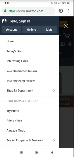
Now, observe that on the site for mobile devices, certain information in the top menu of the desktop version, has disappeared. It’s the case of the “Today’s deals” and “Departments” tabs.
Since the horizontal space is limited on cellphones, these tabs would end up polluting the site’s home screen if they were displayed one under the other. Therefore, Amazon placed them in a side menu.
This is a common feature in responsive sites. Take a look:

The Menu feature
With this feature, the site for mobile devices is able to deliver all information to users without losing usability, i.e., the layout of the information in simple, intuitive and aesthetically pleasant.
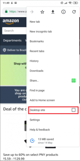
Now, we’ll show you what a non-responsive site would look like, i.e., one which appears exactly the same on both desktops and smartphones, without adaptations that favor browsing on different devices.
To do so, just access the browser’s menu and check the “Site for computer” option to see the page’s original version:

Notice how the fields are displayed exactly as in the first image. However, since cellphones (at least with the screen in portrait orientation) don’t have the same proportions as computer screens, all information on the sides is cut out:

In order for users to access the entire page, they need to drag the screen and zoom in and out, which makes browsing awkward.
Therefore, responsive web design adapts to the dimensions of any device: be it a computer, smartphone or tablet.
The importance of a responsive website
Now that you know what a responsive website is and how it’s different from mobile sites, check out a few reasons why you should think about responsiveness.
User experience
The concept of user experience is so important for digital marketing that it has become a priority. Nowadays, companies don’t sell products or services, but experiences. This is one of the unique traits capable of attracting more customers and building customer loyalty.
Responsiveness is essential for this purpose. After all, it’s quite frustrating for users to go to a page where they find difficulty to browse or that doesn’t offer the same features as the desktop version.
Page Speed
Desktop sites are usually slower. So, by trying to open codes that are incompatible or aren’t adaptable to a mobile device, the tendency is that it takes longer to open.
This is a determining factor for people abandoning a site — 40% will leave a website if the pages take longer than 3 seconds to load.
Ranking on Google
Finally, adapting the website’s configuration from the moment you develop the site is crucial for your rank well on the largest, most popular search engine in the world.
Since 2015, Google has included responsiveness as one of its ranking criteria in its algorithm. Even more significantly, in 2019, Google has announced that an unresponsive site will definitely be affected in its ranking, and that mobile-first indexing is default as of July 2019.
The urgency to adjust your website
As we’ve seen earlier, having a responsive website is a vital step in order to have good results with your digital strategy.
We cannot stress enough how user experience needs to be a priority. In addition, pages unsuitable for mobile devices suffer in speed and visibility.
We hope you found this article useful. If you have any questions, be sure to leave us a comment below :)


